


Brands spend a great deal of time (and budget) personalizing their content so that it will look good online and sell.
And we at Syndigo also want to ensure that these products are represented well on partner sites. Control over your content is critical… And the last thing anyone wants, after spending all that effort, is to see an image that doesn’t look right on a product detail page.
With so much emphasis on controlling the brand experience online, shouldn’t formatting be part of the exercise? A product listing should be engaging, regardless of which connected device is displaying it. And with mobile devices continuing to grow as a primary browsing device, it’s no longer enough to have a static website design that only looks good on a computer screen. Not to mention: you must also consider tablets, laptops with secondary screens, and different smartphone models when coming up with a design.
Slapping your content into a single column and calling it quits isn’t going to cut it.
With a responsive or adaptive web design, you can make sure your website looks its best on all devices – personalized for mobiles, tablets, laptops, and desktop screens. And that improvement in user experience means higher conversions and business growth.
Device Targeting: Adaptive, Responsive
Recently Syndigo upgraded our Content Experience Hub platform to include a capability called Device Targeting. This complimentary feature is an adaptive design technique that works for any in-line content such as feature sets and image widgets.
It automatically adapts to different display sizes and provides pre-determined imagery based on the screen size and layout. Device Targeting gives you the ability to host multiple assets that convey the same message, tailored to the consumer’s browsing device.
This is an especially useful tool as more and more retailers are now dictating the size requirements for their online experiences, and brands want more freedom to make creative decisions on the best imagery to use for each situation.
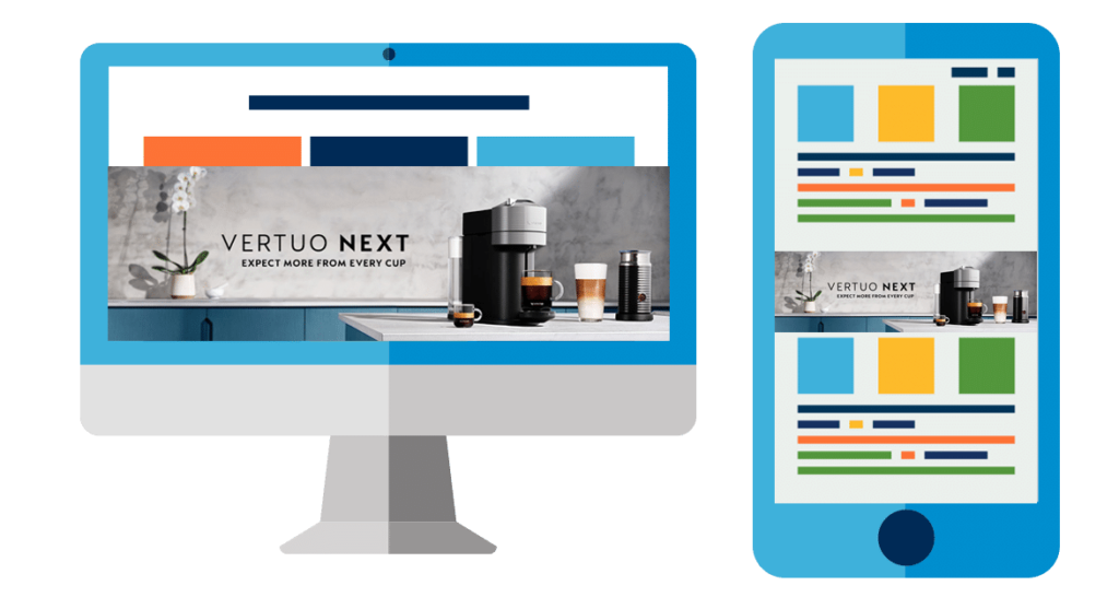
What’s the Difference: Responsive vs. Adaptive Web Design
Both approaches are valid ways to adjust to the many device screens in use today. Responsive Design automatically changes the screen layout of a web page based on the type of device. So a multi-column page may be converted to a single column when viewed on a mobile device. A wide image, however, could be either shrunk, or cropped based on the device’s screen size.
Adaptive Design goes a step further, by delivering an entire page that is designed specifically for the viewing device. A content owner can determine which of several images in their libraries would fit the best for different screen sizes and determine the “breakpoints” for switching from one image to the next – based on pixel count or other metrics. This can help improve image readability as well as navigational functionality and overall user experience.
Here’s one example: A mobile device can display horizontal and vertical imagery depending on the way the device is held. For an image that is tuned for a wide screen, when turned vertically the image gets very small.
Using Device Targeting, however, a supplier can determine a ‘breakpoint’ so that when images are reduced to a certain pixel width, an image that is built for a more vertical image space can be used, to maximize the image and deliver a better user experience.
Another example would be the difference in size between a laptop with 16:9 screen ratio, and one with a more traditional 4:3. If the web page is adaptive to screen sizes, images can also be pre-determined with Device Targeting, based on the breakpoint of screen size.
RESPONSIVE IMAGERY
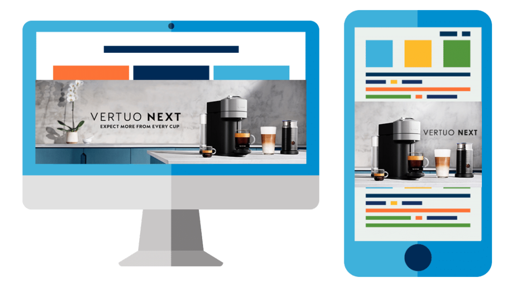
DEVICE TARGETING
An Easy Step (Up or Down)
The first step in personalization is to deliver a consistent brand experience to your shoppers. Even as eCommerce sites have their requirements for posting your content, it helps to have as much control as possible to maintain your brand presence. By enabling the Device Targeting capability on your product detail pages, you gain an easy way to maintain your brand imagery while providing the best impact to your shopper.
And as the sites you sell on become more customized in determining the right content for each device type, you can also scale – automatically – to serve up the in-line imagery that suits the viewer in a more design-friendly way.
With Device Targeting, your Enhanced Content capabilities just got better. The same page now can deliver more personalized experiences, to drive better engagement – and shopper sales. Device Targeting is the complimentary way to deliver the right asset for the appropriate container size, all determined by you. Scale up or down in-line imagery for maximum effect! Talk to your Syndigo representative today about enabling Device Targeting for your product content.


 Don't miss out! Subscribe to our blog for updates.